- HOME
- About Us
- CI
CI
CI is an important element in representing corporate identity through core values and principles. The KT&C CI should be used in accordance with the correct operating instructions to reflect the image of the company and its business.

To maintain the integrity of the KT&C logo, leave enough margin around the logo. This completely differentiates KT&C CI from other logos, copies, images or background patterns that diverge your gaze. The minimum margin should be 50% of the height of the alphabet "K".


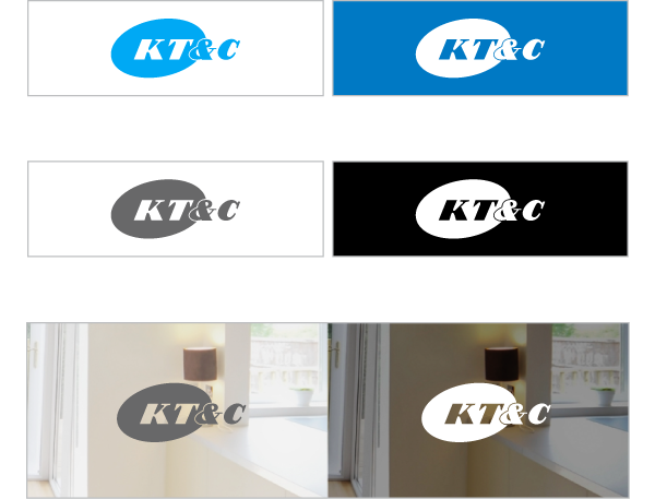
The logo of KT&C is made of a change of sky blue color. The sky blue of KT&C logo means future direction. KT&C's logo should be used in a distinguishable color. When using a logo with a color, the background color is most effective in white contrasting with the color of KT&C CI. If the CI color can not be maintained, it should be used in gray, or on a black background with color reversal. If you use a background image, you should use an image that is bright enough or dark enough to make a clear contrast with the logo.
The colors in CI mean the future-oriented vision of KT&C.KT&C's logo should be used in a distinguishable color. When using a logo with a color, the background color is most effective in white contrasting with the color of KT&C CI. If it is not possible to maintain the original CI color, it should be used in gray or white on black with color inversion. If you are using a background image, you should use a sufficiently bright or dark image to achieve a clear contrast with the logo.


